Go to the landing page In Spanish, because its users are in Buenos Aires.
Salespeople do not fill in spreadsheets. Everyone knows this and everyone keeps shipping spreadsheets. Cóndor is the other bet: you talk to it on WhatsApp the way you talk to anyone, and it does the filing. I design the product; my husband builds it. This is the one project of mine that went out to real users and came back changed.
We started with interviews with working real estate agents, people whose income depends on remembering to call someone back. I did not run the interviews myself. I sat in the process to hear the answers first-hand rather than read a summary of them, which turned out to matter: the useful part was never the answer to the question we asked.
Everyone described the same day. You are out. You see a property, you meet someone, you learn that they have to move before November and that they hate the ground floor. You are holding a phone and a set of keys. The information has a shelf life of about four hours and then it is gone.
And everyone had the same non-solution: a spreadsheet, colour coded, opened at night if at all. The spreadsheet itself was fine. It simply sat at the point in the day when they had the least capacity to open it, so the follow-up quietly did not happen.
That reframed the problem: the job was to remove the act of filing altogether.
WhatsApp. Not because it is fashionable to build on it, but because it is the only surface these agents open without deciding to. Any new app, however good, asks for a habit they had already told us they do not have.
So the first version did one thing. You send Cóndor a message, by voice or by text, in whatever order the sentence comes out. It reads what you said, works out who you are talking about and what matters, and files it. Then you tell it when to bother you, and it does.
Voice mattered more than we expected, and it came with a rule. Somebody walking out of a meeting talks; they do not type. But a system that writes to your client book from a transcription of a moving car is a system that will eventually write something wrong. So it transcribes, tells you what it understood, and only files once you confirm. One extra tap buys the whole thing its credibility.
Everything else was cut. No pipeline, no stages, no import, no dashboard. The point of cutting that hard was speed of proof: if agents would not talk to a bot, we needed to know that in weeks, not after building the whole thing around a false premise.
The riskiest assumption was written down before anyone wrote code, in the form of a number we could be wrong about: would agents actually log contacts in their first week without being chased? That is a testable sentence, and it is the reason the scope stayed small.
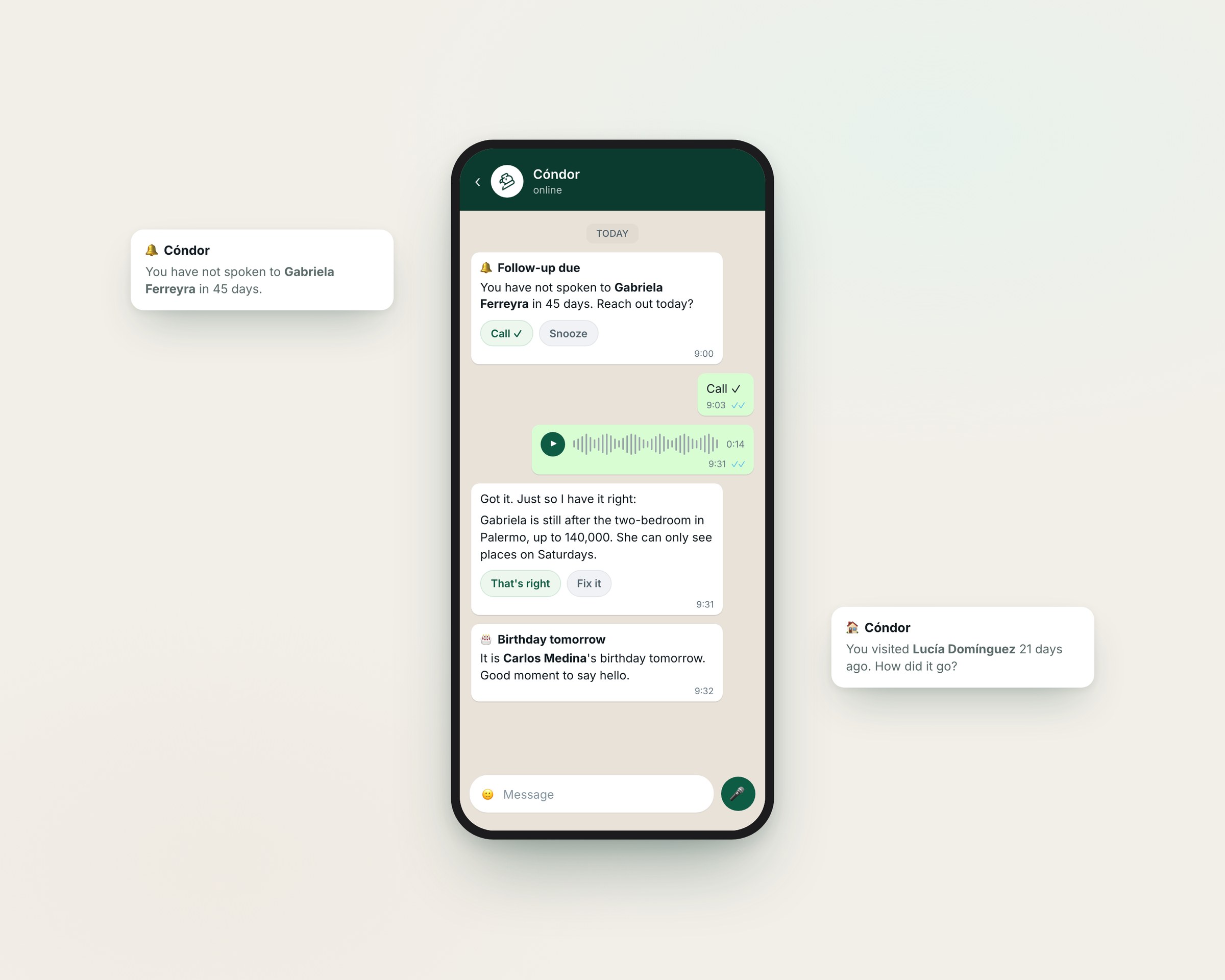
It went out to a first cohort of ten agents, onboarded one by one by hand. Ten is a small number and that was the point: at that size you can watch every person individually, and the setup being manual meant nobody bounced off an empty product on day one. That cohort closed full and there is a waiting list for the next.
The requests that came back had little to do with the ones we had queued up. They came from people holding the product, who could suddenly see what else it could be.
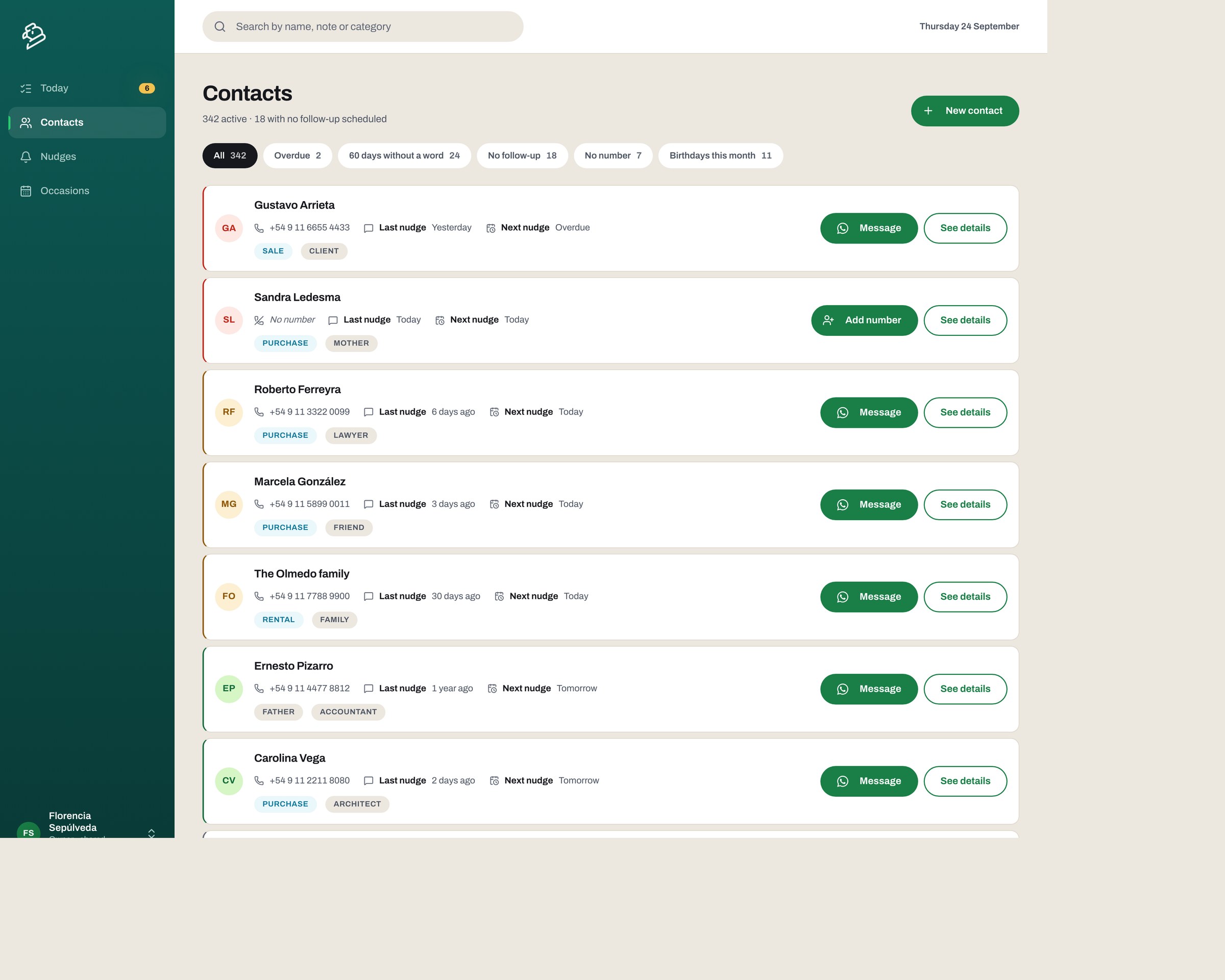
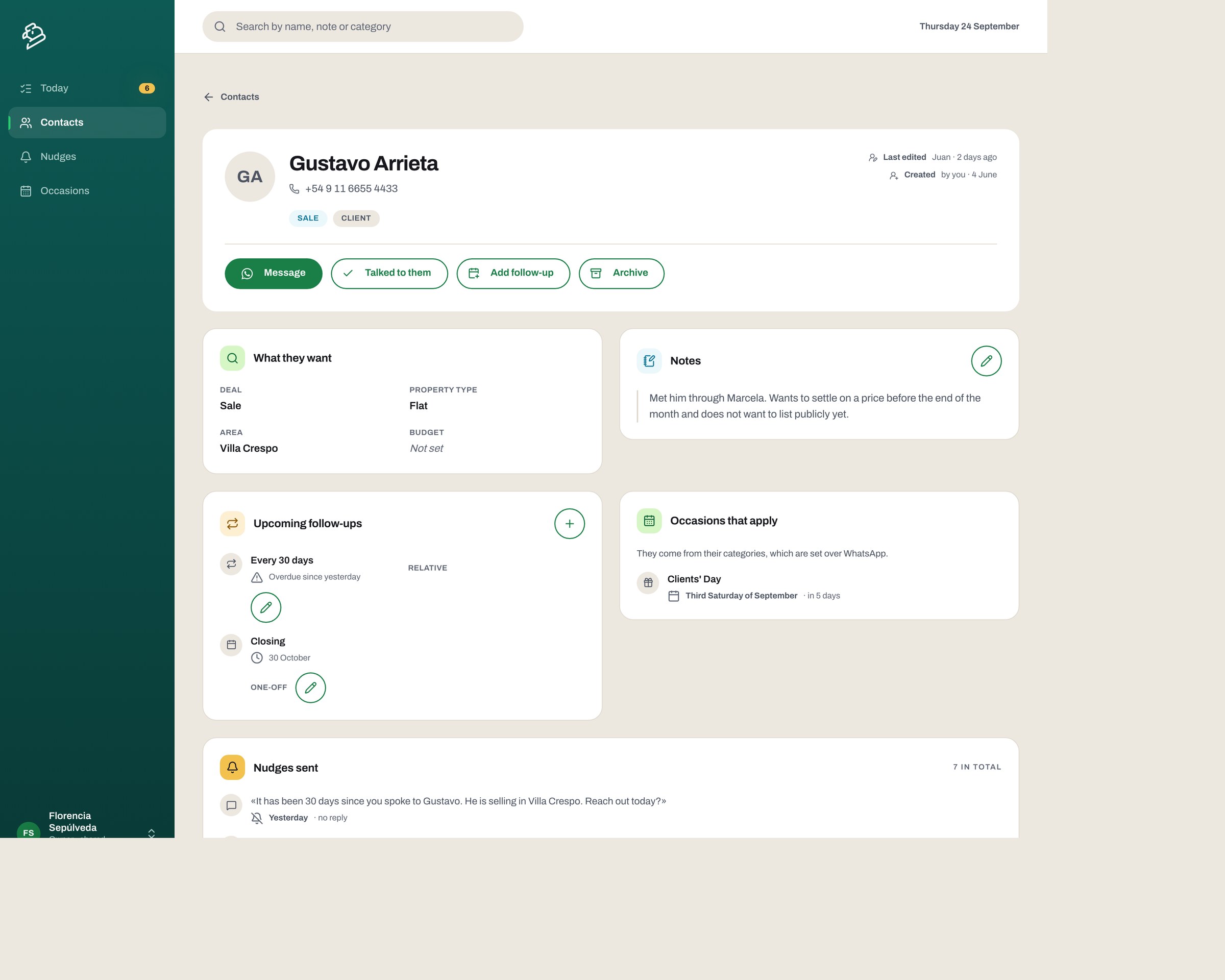
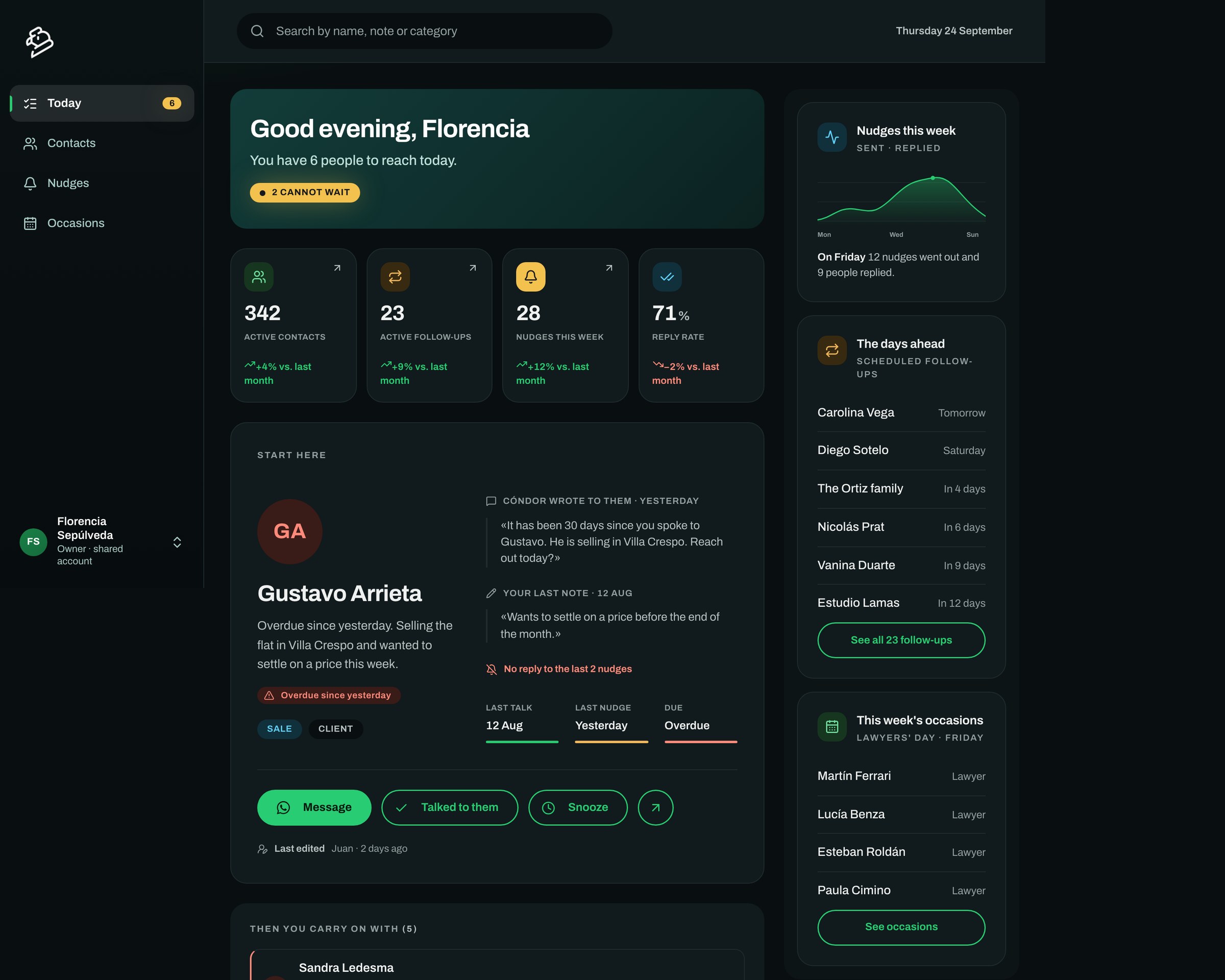
The biggest one: they wanted a screen. Not instead of the chat, alongside it. A conversation is linear and it forgets; something mentioned two hundred messages ago is still in the database but getting it back means asking again or scrolling. When they were at a desk rather than on the street, they wanted to see the whole book at once, compare, correct a typo, look someone up by a half-remembered note.
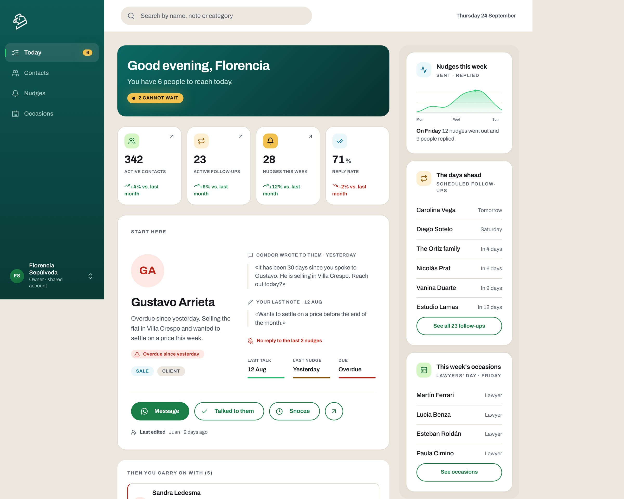
That became the Panel, and it is the half of the product I own the design of. The rule I set for it came straight out of the reason it exists: the Panel never duplicates the chat. Anything it does has to be something a conversation structurally cannot do, which is see the set, compare, find and fix.

By the time I took the Panel on properly it had grown one screen at a time, each one solving the ticket in front of it. That is how most software gets made and it is not a scandal, but it leaves a product with no answer to the question of what it is for and who it serves first.
So the redesign started with that question rather than with the visual layer. The whole authenticated interface was in scope: contacts, reminders, occasions, the account, the navigation and every state, including the empty and error ones that nobody had drawn.
One decision shaped the rest. The Panel does not sort people into stages: no pipeline, no funnel, no columns for prospect, client and closed. A contact is the same person at different moments, and sorting them into buckets would have handed the agent one more thing to keep up to date that nobody was going to read.


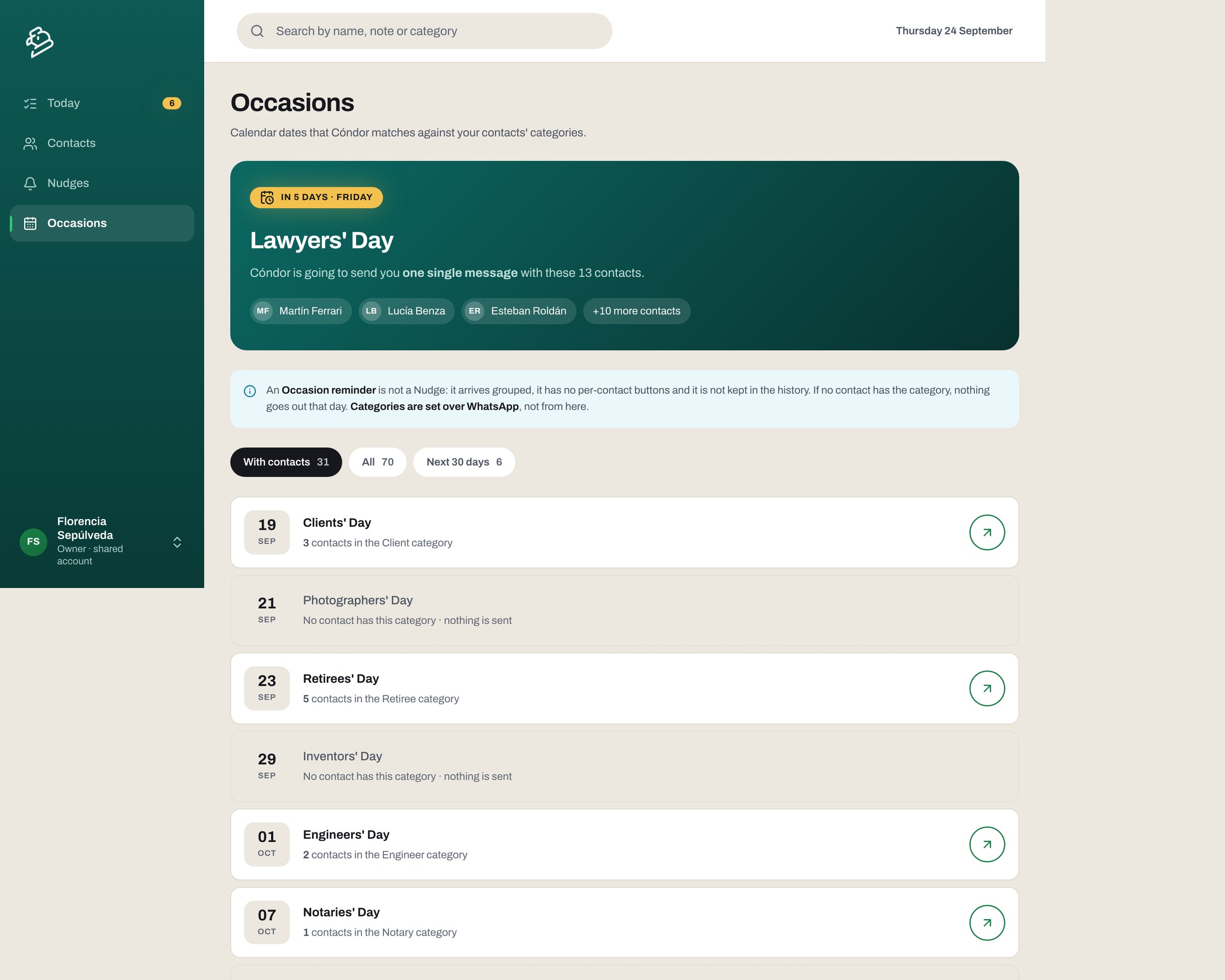
Argentina has a calendar of professional days. Lawyers get one, notaries get one, engineers get one. Agents told us, as an aside, that they use these to get back in touch without a reason that looks like selling.
Read literally that is a request for a greetings scheduler, which would have been a bad product. What they were describing is a way to appear in someone's day without asking them for anything, and the calendar was just the excuse they already had.
So occasions are not a message tool, they are a join: the dates sit on one side, the categories on people's records sit on the other, and the product matches them. Tell Cóndor that Paula is a lawyer and she joins the list on her own. The list builds itself, which is the only version of this that survives contact with a real book of three hundred people.
Two rules keep it from becoming spam, and both are visible on the screen rather than hidden in the logic. If no one in your book has the category, nothing goes out that day. And when several people do, it arrives as one message with all the names in it, not as a stack of separate alerts, because the second one is how a helpful product starts feeling like a nagging one.

The two of us work in a straight line. I design the Panel and build it as navigable HTML with the real tokens, the real states and the real interactions, and he implements it in React. Nothing gets reinterpreted from a static frame, and the questions that usually surface during development, what happens when this is empty, what happens when the name is too long, get answered before he starts.
That is also the honest description of my technical range. I started in front-end when it was HTML, CSS and JavaScript, and that is where my sense of what is cheap and what is expensive comes from. I am not the React expert on this project and I am not trying to be. What I am is a designer who can hand over something that already behaves.
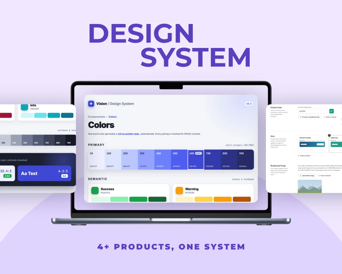
Underneath both sits a small design system: tokens for colour, spacing and type, the components documented with their states, and a contrast report generated from the tokens themselves so it cannot quietly go out of date. Light and dark are not two designs, they are one set of tokens resolved twice.

Those are two different instruments and I had been treating them as one. Interviews are good at the shape of a problem and bad at the shape of a solution: people described their day accurately and their ideal tool badly, and if we had built what they asked for we would have built a nicer spreadsheet.
Use is the opposite. It is useless for finding the problem, because you need something to use first, and it is the only thing that finds the cases your hypotheses did not cover. The panel is the clearest example: no one requested it, and it is now half the product.
The other thing I took is about scope. Cutting the first version to a single bet felt like giving things up at the time, and it is what made the answer arrive early enough to still be worth having. Everything built afterwards was an answer to something ten real people did, rather than to a guess of ours.