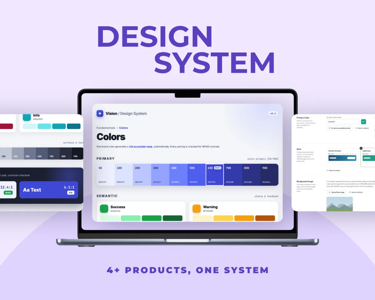
Open the interactive prototype Both apps, navigable end to end. Switch sides with the toggle at the top.
A dog walking marketplace needs two apps. The person booking a walk wants to know their dog is safe with a stranger; the person running it is outside with several leads in one hand and has to log what happened in one tap. I designed both sides and prototyped them navigable, with real states and real validation, built from a design system the two apps share.
DOGGO started as an app I had sketched a while ago and never finished. Coming back to it, what pulled me in was the shape of the problem: the two people in this marketplace want opposite things, and the product has to serve both without splitting into two unrelated apps.
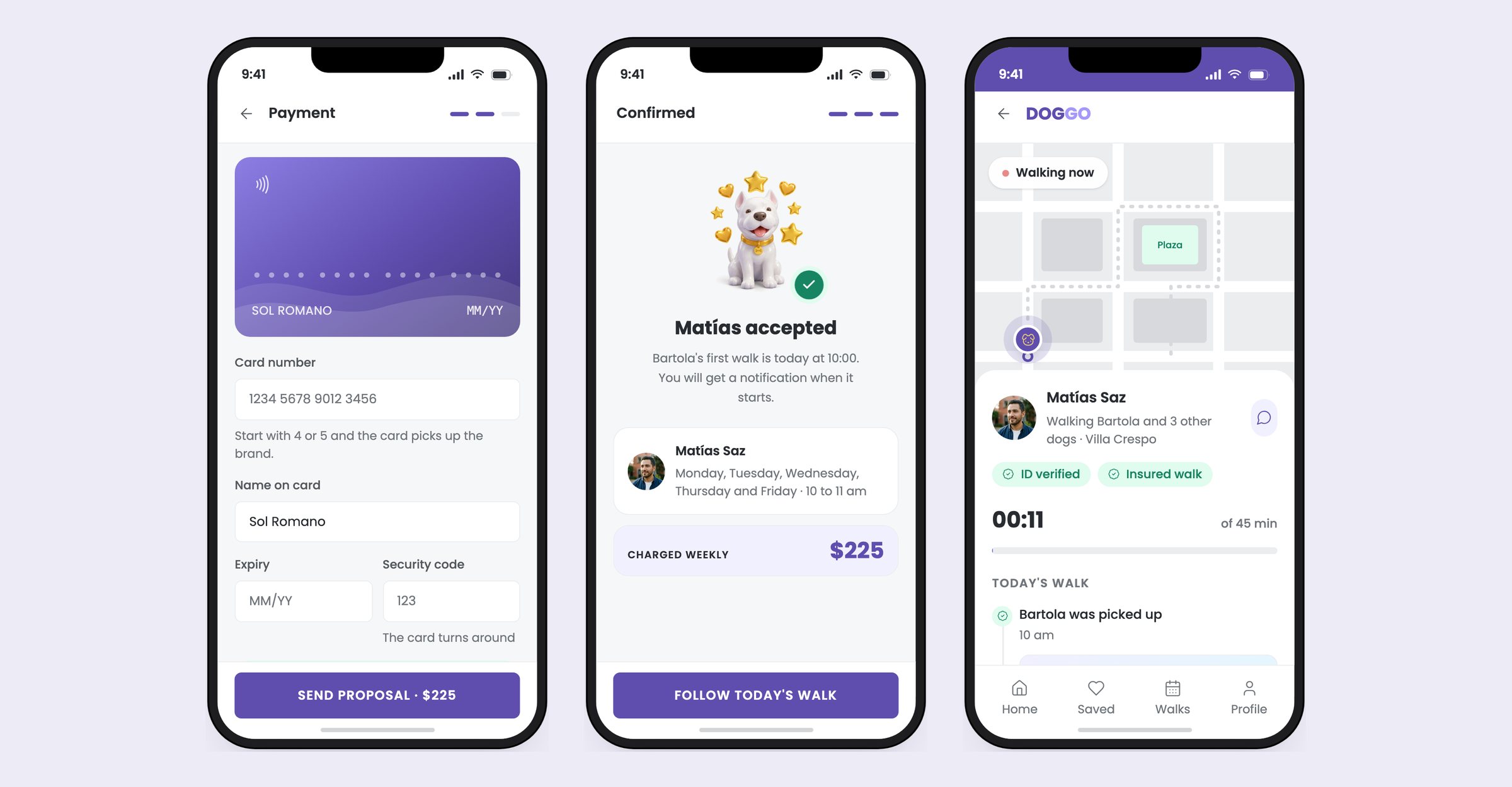
The hypothesis I set out to test was this: if the person at home can see what is happening as it happens, the walk stops being an act of faith. What she sees are the small facts. Who picked the dog up. That it drank water. That it is home. All of it arriving as it happens, and costing nothing to the person outside holding the leads.
Everything the pet parent gets for free costs the walker a tap, in the street, in the rain, with a dog pulling. If logging is work it does not get done, and then nothing reaches the person at home.
These are assumptions, not findings. I have not run formal interviews for DOGGO; I built two profiles from the way this service works and designed against them, which is enough to keep decisions honest but not enough to call it research. Where a decision needed evidence I did not have, I said so rather than dressing it up.
Sol works from home and cannot take Bartola out in the morning. She is not shopping for a walker every week; she wants to find one, try them, and stay with them. Her home screen is built around that. It opens on a question about today, and the search only sits there until she has answered it.
Matías walks dogs during the week around the neighbourhood, several on the lead at once, phone in the other hand. What he needs from an app is the shortest possible distance between something happening and the owner knowing about it. A dashboard would be useless to him.
It is a normal sight here. A walker collects dogs from several buildings, often several floors of the same one, and walks them together; some drive a van to a park and come back three hours later with a dozen. Nobody in Buenos Aires walks one dog at a time, because nobody could make a living doing that.
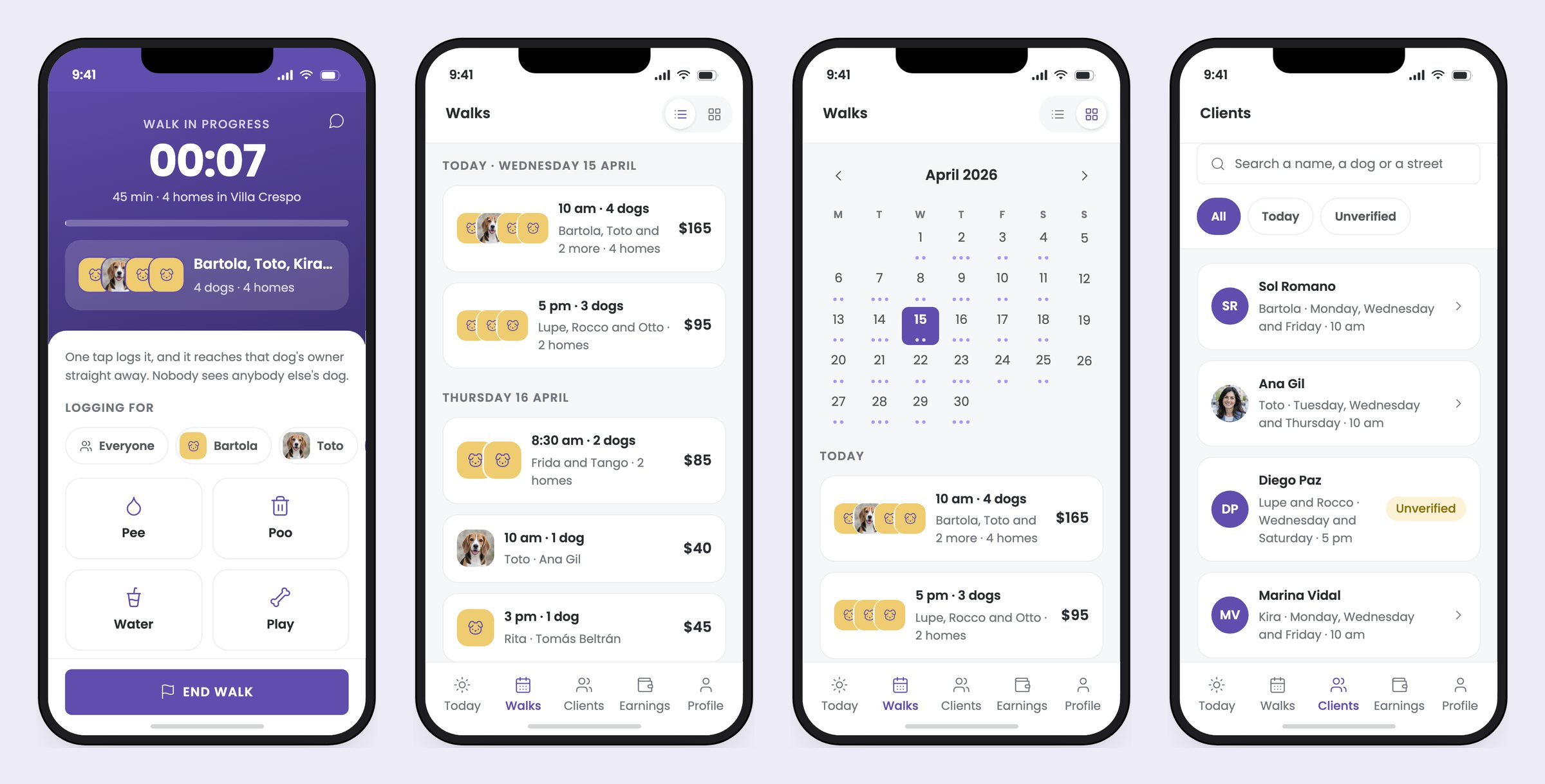
That is what makes the logging hard. One person, both hands busy, who has to tell eight different homes what happened to eight different dogs.
So a booking is a round: an hour with however many dogs are in it. Two homes at ten o'clock is one walk with two dogs. Listing it per client would tell the walker he has two jobs when he has one.
The interface follows from that. He picks which dog he is logging for once and it stays picked, because nobody with five leads in one hand is going to confirm a dog after every tap. Photos always go to every home, since one picture of the group at the plaza is news for all of them. And each owner sees their own dog and the group's events, and never somebody else's dog.
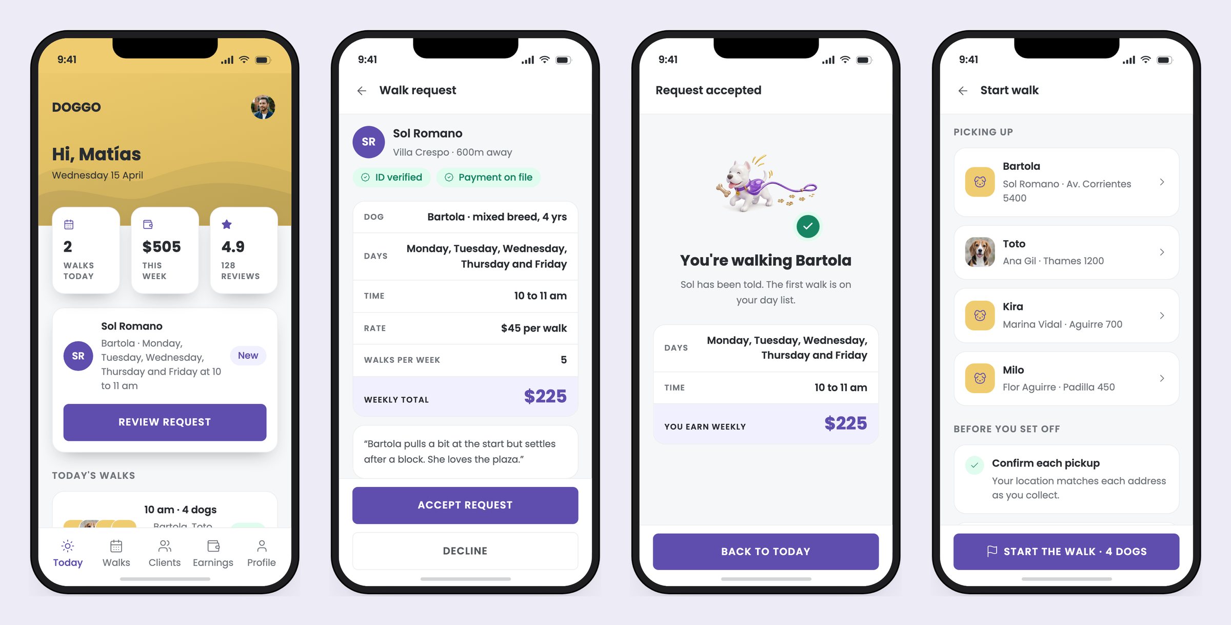
A booking is a proposal. Sol picks the days and the time, watches what the week costs as she picks, and sends it. Matías accepts or declines. All the back and forth that this kind of app usually pushes into a chat thread, where nothing gets written down, never happens.
The day picker only offers the days he actually walks, so a booking that was never going to work cannot be built, paid for and then declined.
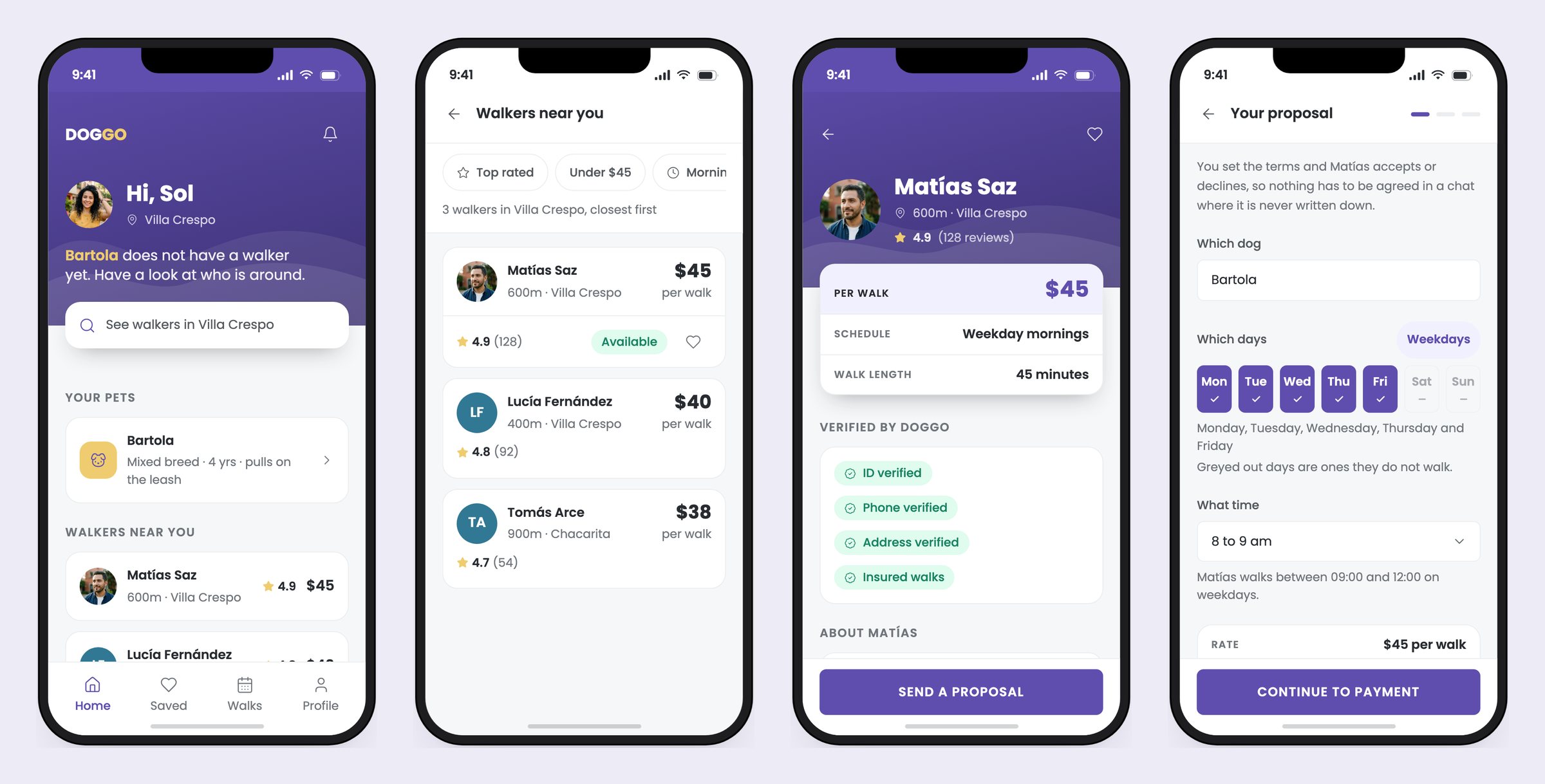
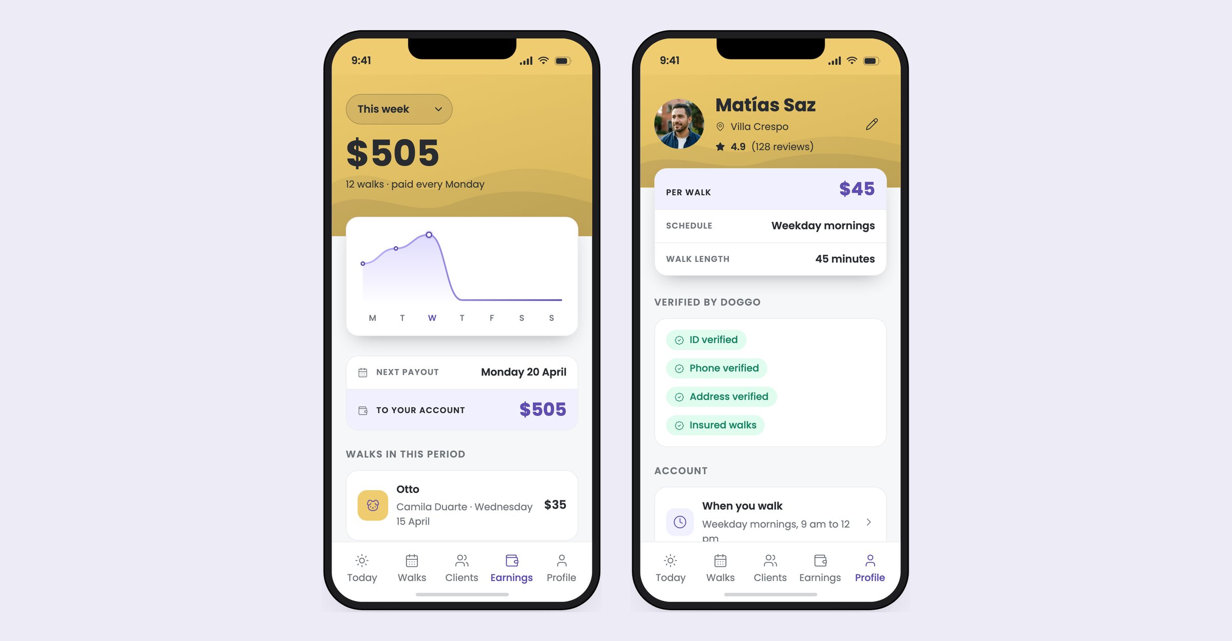
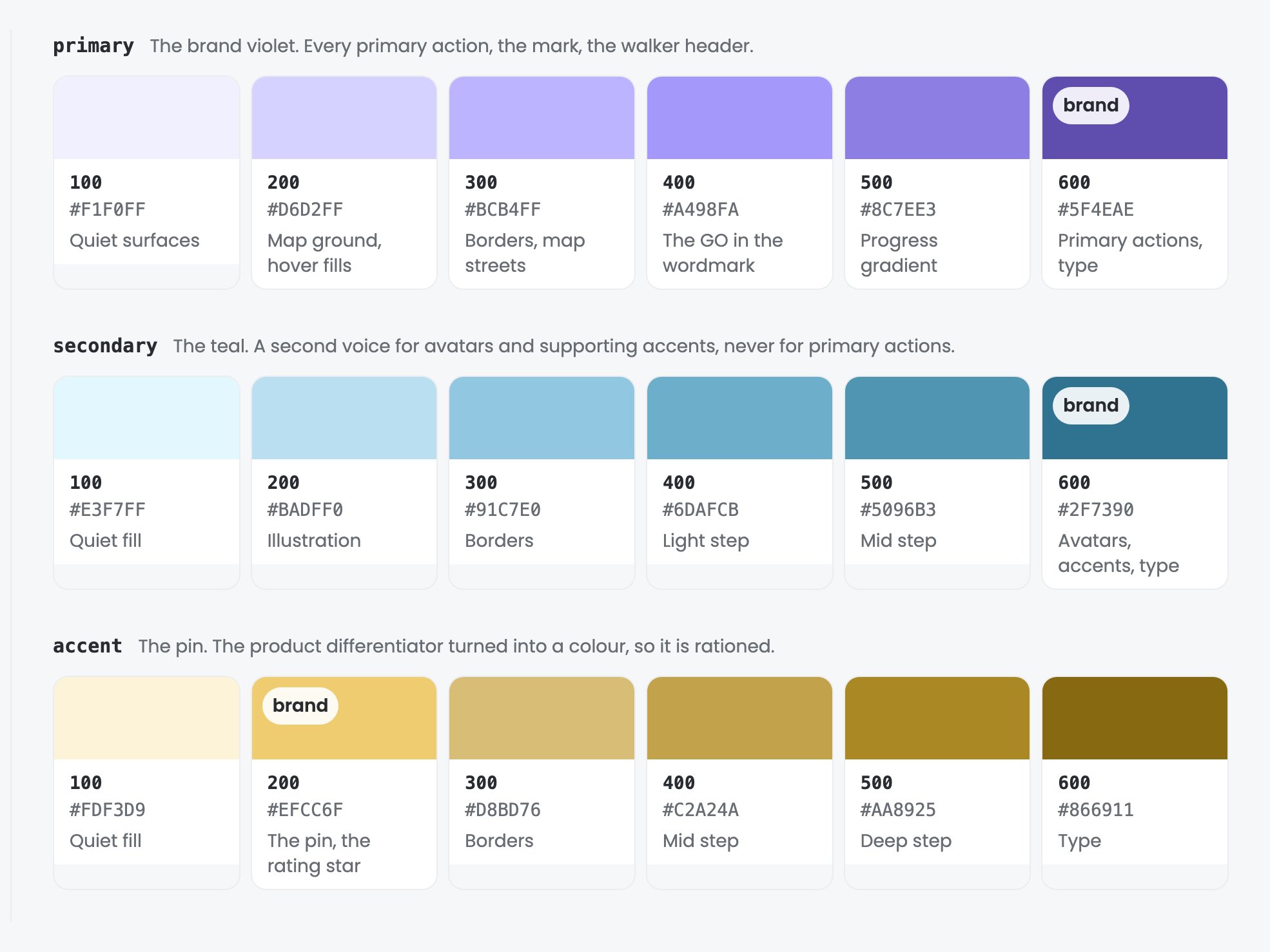
Both apps come out of the same set of components. That is what stops them drifting, and it is also why they needed something to tell them apart. The header does it: violet for the pet parent, yellow for the walker. Without that, a screenshot of one side reads as the other.
The yellow is a light surface, so everything that sat on the violet had to be rebuilt for it: the type, the wave motif and the wordmark all change. That work lives inside the hero component rather than in the walker screens, which is what lets one component serve two brands without either side owning a copy of it.
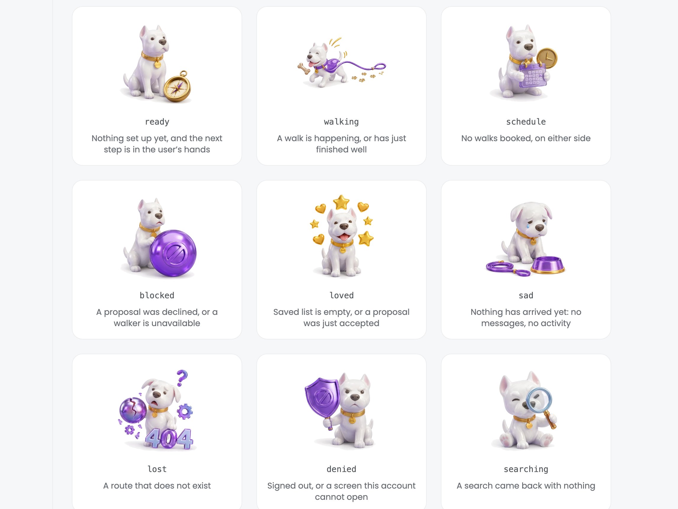
The design system is what the product is built from, and several of its rules live in the code rather than in a review. An empty state takes a named mood and cannot be handed a loose icon. It will not compile without a way out of the screen. A type size outside the seven steps is not available to write in the first place.
Contrast is measured in the browser at render time rather than pasted into a document, so it cannot quietly stop being true. Every spacing value is a multiple of four, with two exemptions I wrote down: device chrome and hairlines.
Underneath all of it there is one rule: anything both apps show is one component, never two copies, and where the sides differ that difference is a prop with a name. That is what makes a weekly total mean the same thing to the person paying it and the person earning it.
I designed DOGGO from the problem up and prototyped it end to end with Claude: React, one shared state machine, real form validation, real empty states. A prototype you can actually use answers questions a static frame cannot, because a booking has to move through every state in order and each screen has to hold up at each one.
It is how I want to work from here: design it properly, then build it far enough that the weak parts have to show themselves.